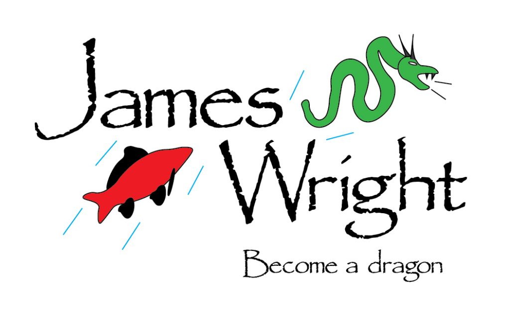
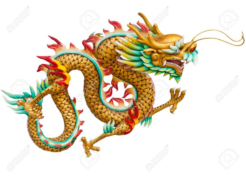
This is my logotype created in Adobe Illustrator. As stated in my influences blog post, this logotype was inspired by Japanese Yakuza tattoos, specifically from the video game series “Yakuza”. My original plan was to make the logotype look like a tattoo that you would find within the games and implement elements of certain animals and figures found throughout Japanese myths, however this turned out to be a little too ambitious as upon starting my work within Illustrator I quickly realized that I am not a tattoo artist and that my original vision was not in the realm of possibility. I instead decided to scale back the design while still staying true to the influences detailed in my first blog post by focusing on the specific tale that I had mentioned in blog post one, that being the carp swimming up the river in order to become a dragon. The way I decided to portray this myth was by having a carp jump up from the bottom of the logo and come out the top as a dragon. I created the carp with the curvature tool on Illustrator while using this picture on google images as inspiration.

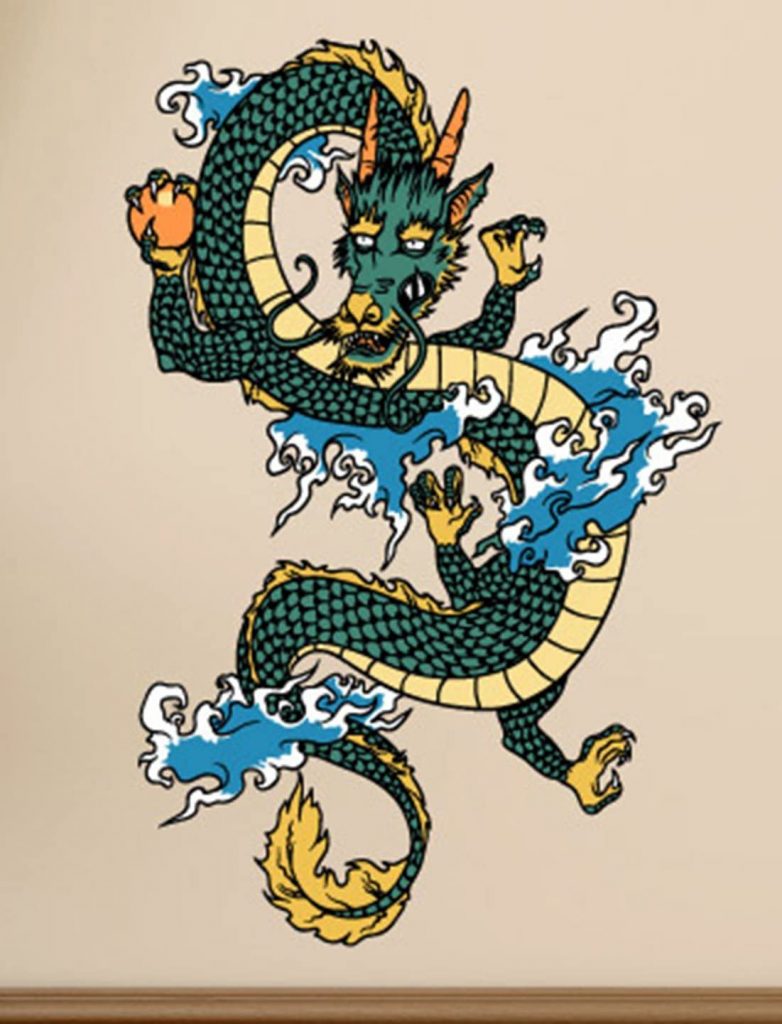
I then added little streaks of water around the carp to imply that the fish had jumped out of a body of water and wasn’t just flying in the air. The dragon was created using a similar method to the carp however I used multiple images for inspiration rather than just one. I originally gave the dragon wings and limbs however I was unhappy with how they looked so I decided not to use them.
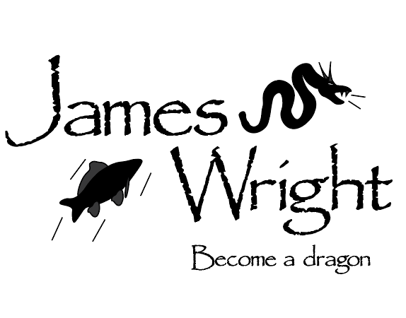
When deciding what font to use for the logotype I ultimately went with Papyrus as I feel as though it has this Japanese / eastern look to it that fits quite well with the subject material the logotype is based on. I chose to present the name diagonally as I thought it looked clean and it also gave me the space needed to show the carp and the dragon. Originally the logotype was going to be in black and white however I decided to change this as when I was experimenting with different colors I found that red and green looked much nicer and also more closely resembled the influences used for this project.
I thought that “Become a dragon” was an appropriate tag line to use as not only is it relevant to the myth that the logotype is based on but I can also see it being a tagline for some sort of meditation or martial arts company, who’s goal it is to metaphorically turn people into dragons.
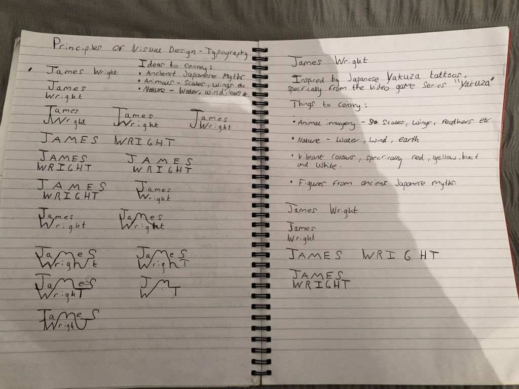
Here are some of my early notes for this project where I mostly experimented with different ways to present my name.
0 Comments