Layering and separation is an important thing to consider when displaying information as it can be used to make visual information more clear and easier to follow. This is done by making each separate layer of information distinguished enough from one another that each layer can be viewed as its own thing with its own meaning while all coming together to create a greater whole. This is most commonly done through the use of colour. Without effective use of layering and separation separate pieces of information can blend together and have their meanings become muddled.
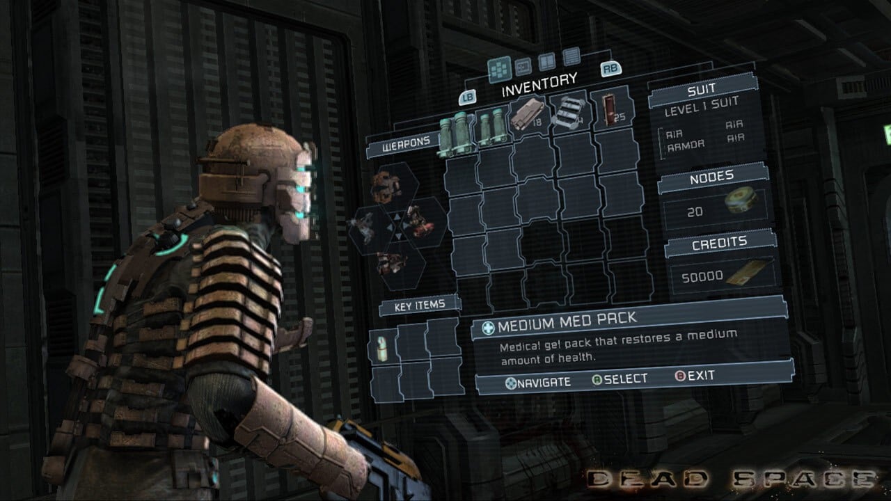
For my example, rather than looking at how layering and separation can be used to display information, I have decided to examine how layering and separation can be used to heighten player immersion. In the game “Dead Space”, the player’s inventory screen is designed to look as if it is being projected from the protagonist’s helmet out in front of them. This is achieved by having the inventory exist on its own layer within the game world. This effectively creates three layers, the first one being the character in front, the second being the inventory in the middle, and then the third being the background at the back. This layering allows the player to view the inventory in the same way that the protagonist does, as a part of the world in front of them. This keeps players grounded and immersed in the game world and lets them see themselves more in the protagonist’s shoes than they would if they were taken away to a different scene entirely that the protagonist themselves wouldn’t see when opening the menu. The three layers are also distinguished by different colours causing them to stand apart and not blend together. The protagonist’s suit is mostly brown, the menu uses shades of blue and the background is largely very dark with lots of black and grey.
0 Comments