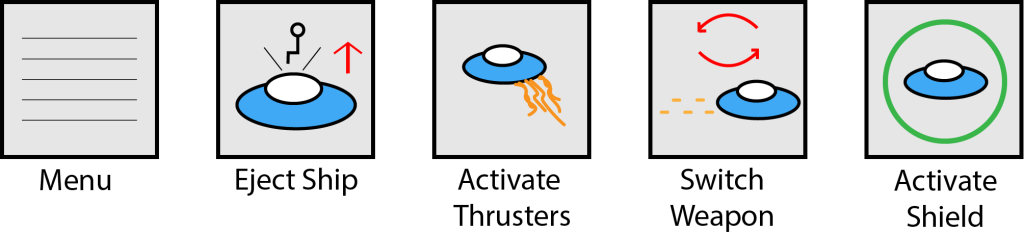
For layering and separation I decided to go back to my buttons I designed in the small multiples post and edit them slightly in a way that makes them more readable and accessible. In the original designs the buttons only consisted of two colours (black and grey) and all the lines they were made out of were all the same size. While looking clean and simplistic, this also caused them to become muddled and could have been hard to interpret for people with sight issues as there was no colour or depth to be to able to tell the individual parts apart. To fix this I added colour to the most important parts of the buttons. These colours separate the different layers and eliminates any chances of the shapes blending together and their meanings becoming lost. I also increased the thickness of the borders in order to make them stand out more and feel separate from the rest of the artwork.
0 Comments