For my design research diary I have decided to explore how game developers utilize Edward Tufte’s theories in order to convey important information to the player. In this first blog post we will be looking at Tufte’s theory about the use of colour and the ways in which colour is used to display information within videogames.
Using colours to label information is a very useful way to communicate things to the player non verbally. This is because certain colours already have preconceived notions to us thanks to our real life experiences. An example of this is how video games choose to represent information such as player health.
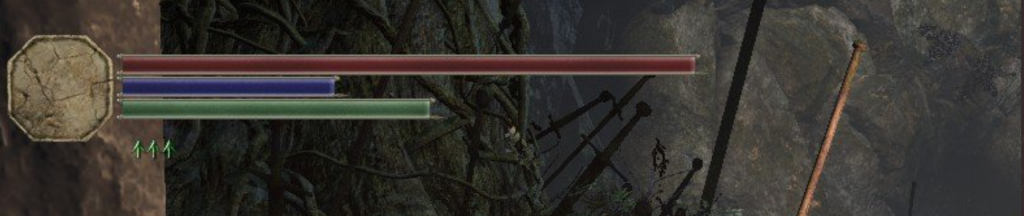
Many games choose to display the players health through the use of a red bar. The reason for this is red is typically associated with blood by many people, therefore upon first glance a player will be able to tell that this bar signifies the amount of life / hit points the player has remaining without having to have it explained to them through the use of a tutorial. If this bar was another colour like purple, it wouldn’t be immediately clear what the bar is supposed to represent and would cause confusion for the player. This is because one of the most important things when it comes to colour in information design is for colour “to represent or imitate reality” (Tufte, 1990).
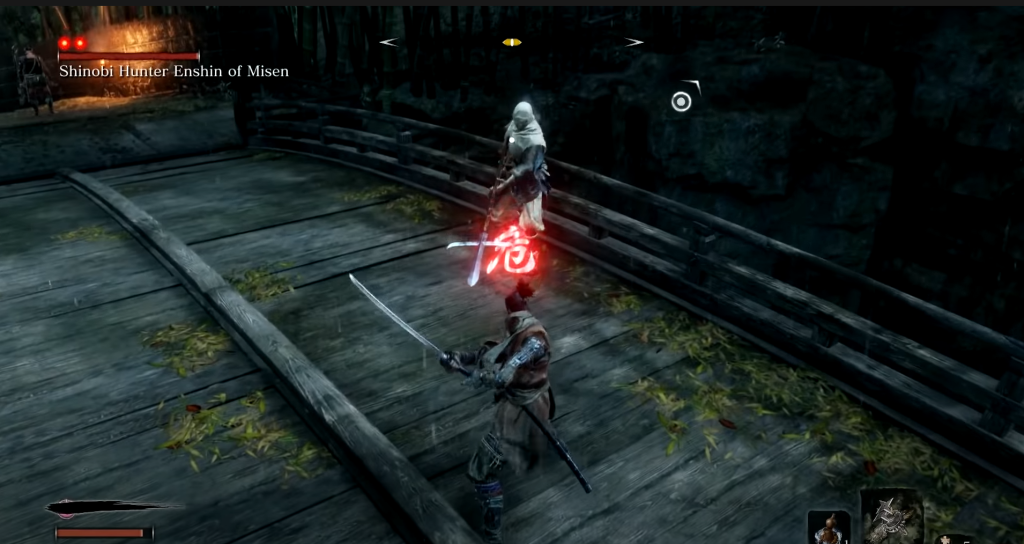
Another way video games use colour is to signify danger. Along with blood, red is also commonly associated with danger. This could be due to the association with blood implying death / damage but also because of things like red being a common colour to convey danger on signs in real life. In the above image we see a red symbol appear above the players head. This signifies that the incoming attack can’t be blocked and therefore must be avoided. The colour red implies danger so upon first seeing the symbol the player is already informed, even if its just subconsciously, that the incoming attack is more dangerous than usual and will require a different approach. The effect also uses a very bright glowing red, which implies that instant action is required more so than if it was a more subdued red. This relates to how Tufte says shades of colour can be used “to measure (color as quantity)” (Tufte, 1990).
Bibliography
Tufte, E. (1990) Envisioning information. Cheshire, CT: Graphics Press.
0 Comments