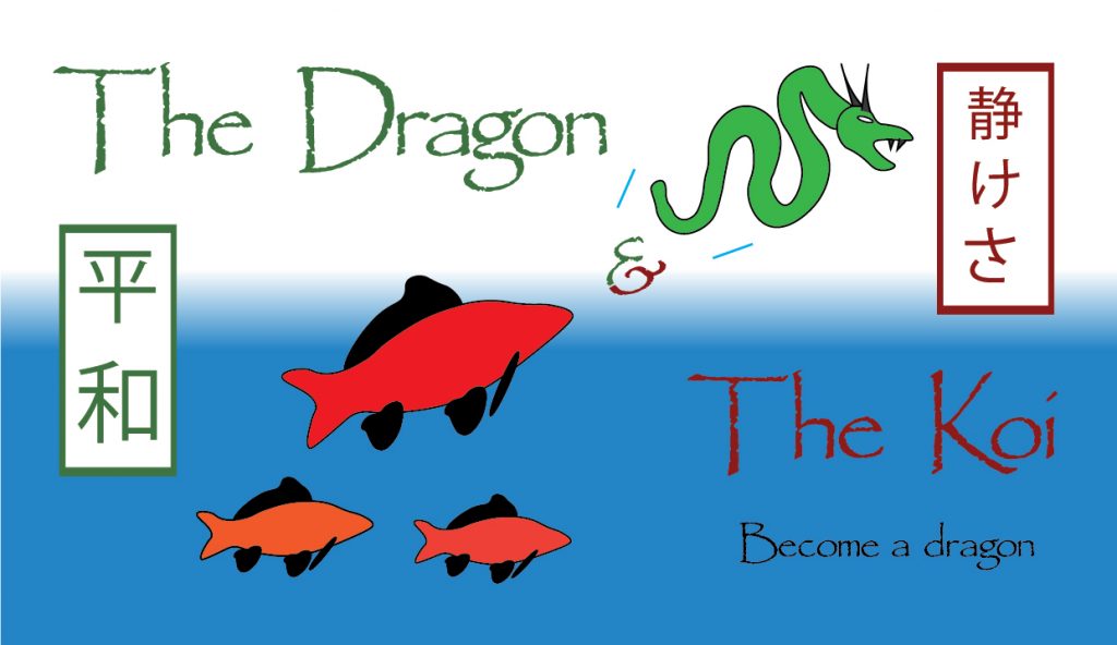
This is my final design for blog post four. Upon starting this task I wasn’t sure what to add as my logotype already had a visual element with the carp and the dragon, however after thinking about it for a little while I came up with a few ideas.
Firstly I decided to put a rectangle behind the logotype and then used the gradient tool to add a vertical fading blue effect. This caused the bottom half of the logotype to look like it was underwater which was appropriate and made sense considering the carp. I then removed most of the blue lines that used to signalize streaks of water as it no longer made sense to have them.
Next I decided that there was a bit too much empty space underneath the carp that needed filling up. To address this I copied the carp and then pasted two extra smaller carps underneath the big one. I changed the colours slightly on each of them to make them stand out from each other. I think this makes the logotype look more full and consistent as there are no longer any empty spaces and every part of the logotype is being used to some extent.
Finally I chose to put two rectangles on both sides of the logotype with each containing Japanese text. The rectangle on the left contains the word “Peace” and the rectangle on the right contains the word “Tranquility”, both in Japanese. I chose to do this as I think the themes of inner peace and transformation are relevant to my chosen subject and make sense for this logotype, which I can imagine being the logo for a company who specializes in meditation or something along those lines. I also thought it acted as a nice way to fill up the empty space that existed next to both the dragon and the carp. I used guides to make sure that everything was perfectly in line with each other.
0 Comments