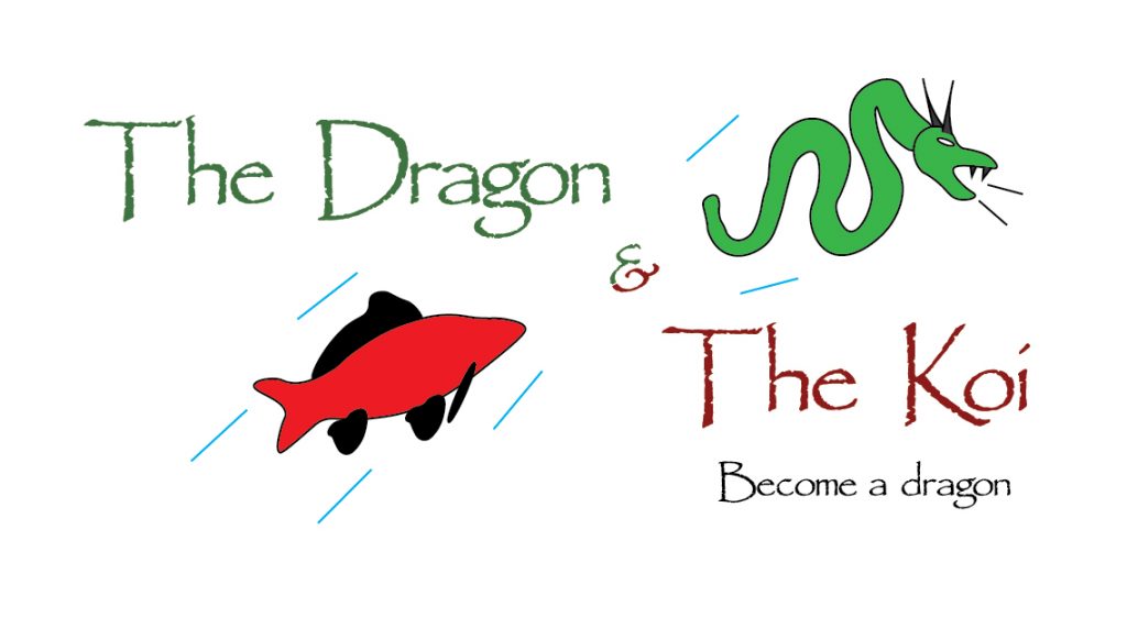
This is my logotype design for blog post three. I decided to replace my name with “The Dragon & The Koi” as not only is it descriptive of the logo itself, with both the picture of the koi carp and the dragon, but it is also the name of a chapter from one of the games that influenced this project.
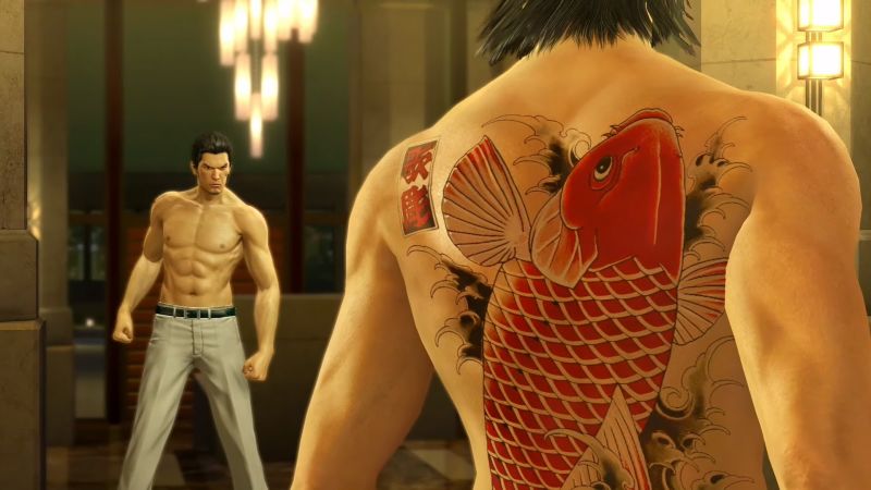
In terms of the colour of the logotype I chose to go with just two colours, green and red. I did this as I thought that the words being the same colour as their corresponding illustration would give the logotype a sense of consistency and simplicity. If I had gone with drastically different colours then I feel like it would look a bit messy and overly complicated. However while I chose to go with green and red, the actual shade of green and red is completely different to the shades used for the illustrations. For the red, I used the eye dropper tool in Adobe Illustrator and used it to copy the exact shade of red from an image of the game “Yakuza Kiwami”, the shade being taken from the tattoo on the back of the character “Nishkiyama”.
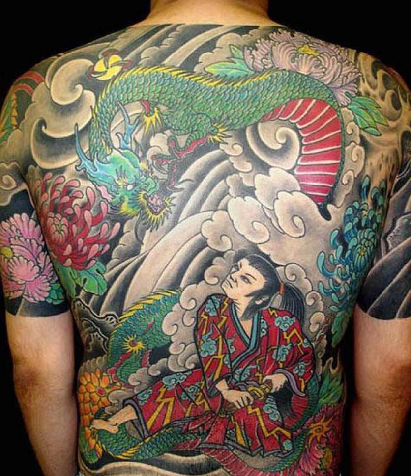
As for the green I used the exact same method however rather than using a colour from the game, I used the shade of green used within this picture of a real life yakuza tattoo, specifically the green from the dragon.
I also decided to split the “&” in half and make half of it green and the other half red. I did this because keeping it black made it look out of place and making it either fully red or green ruined the symmetry of the logotype. I did this by splitting it in half and with the eraser tool and then ungrouping them, causing both halves to act as separate entities. Overall I think it looks clean and makes the logotype look balanced. Finally I decided to keep the tagline black as making it either red or green would have also ruined the symmetry of the colours used in the logotype.
0 Comments